Theme design guide
Theming explains how a QuizWitz theme is built: in Adobe Animate, exported as a CreateJS library. This page covers the step before that — designing the theme.
It is written for a graphic designer, and it assumes the design and the Animate production are done by different people. Few designers still work in Adobe Animate, so a common arrangement is that a designer delivers artwork and someone else assembles the theme. That works well, but only if the artwork is handed over in a shape the build can actually use. This page describes that shape.
If you only want to change colours, fonts and backgrounds, you do not need any of this — customise the Emerald theme instead.
What you are designing
A game of QuizWitz is played by a whole room at once, and two screens are always involved:
- The shared screen — a projector or TV, 1920 × 1080. Questions, answers, how the room's answers were spread, the standings. This is what you design.
- Each player's phone, where they type their answer. That is a web page with a fixed layout; it is styled from your colours and fonts, not laid out by you.
A theme is the complete visual skin of the shared screen: background, typography, colour, the way a question with four options is presented, how the standings build up, how a round is announced.
Seven frames
The game has roughly twenty-five distinct screen states, but most are variants of the same layout. You design seven frames; the rest is derived from them. That is not a shortcut — it is how the engine works. A screen with no artwork of its own falls back to a general frame.
| # | Frame | What is on it | What is derived from it |
|---|---|---|---|
| 1 | General frame | The background, a header title and an empty content area below it. The visual template for the whole theme. | Thirteen screen states: round explanation, standings, player introduction, multiple-choice variants, long questions, seat warnings, settings. |
| 2 | Connect screen | What the room sees to join: five lines of instruction, room for a join code or QR code, and a list of players trickling in. | Also the waiting screen shown while the quizmaster reads the question aloud. |
| 3 | Question screen | The question, a timer, four answer options, a feedback line. The screen the room looks at longest. | — |
| 4 | Question with media | The same, arranged around an image or video. May be a different composition from frame 3. | Also the full-screen media variant, and media shown between questions. |
| 5 | Answer screen | Which answer was correct, how the room's answers were spread across the options, and a feedback line. | Also the answer screen for open questions and for questions with media. |
| 6 | Standings and winner | A list of players with name, score and position. Supply the player row as a separate, reusable element — it is repeated six to ten times. | Both the standings between rounds and the final winner. |
| 7 | Round intro | A short announcement per round category. There are six categories: science & technology, nature, entertainment & music, sport, art, history. | All six categories. |
What is decided for you
- The individual controls. Buttons in their four states, the correct and wrong symbols, the scrollbar, checkboxes and selects are derived from what appears in your seven frames. Make sure a button appears somewhere, so there is a style to take them from.
- The players' phones. A fixed HTML layout, styled from your colour list and fonts.
- Which screens fall back to the general frame, and how.
- How the six categories map onto the round intro artwork.
- All timing and animation duration.
A character is optional
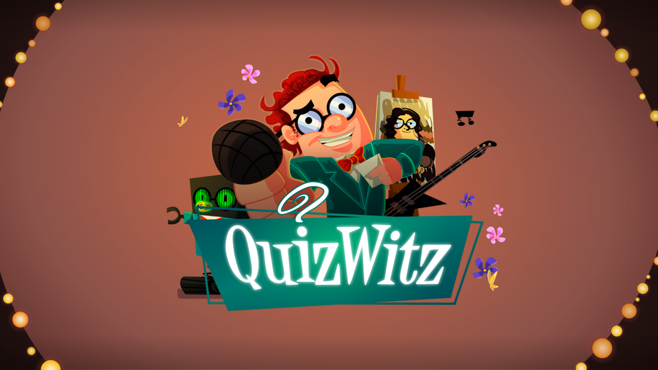
The stock QuizWitz theme has a character that talks and reacts. Nothing requires one: the theme validator only warns about the ted element; it does not fail without it. The Emerald theme ships without a character, and dropping it removes the most expensive animation work — lip sync, eyes, arms.
Without a character, the round intro becomes a graphic, typographic or illustrative moment. Two approaches keep the work in proportion: one composition with a colour or icon variant per category, or a single universal announcement with only the round name changing. Six genuinely different intros is a lot of work for a few seconds of screen time.
What these frames look like in practice
The screens below come from an existing theme. They are here to show what happens on each screen; they are not a style reference.
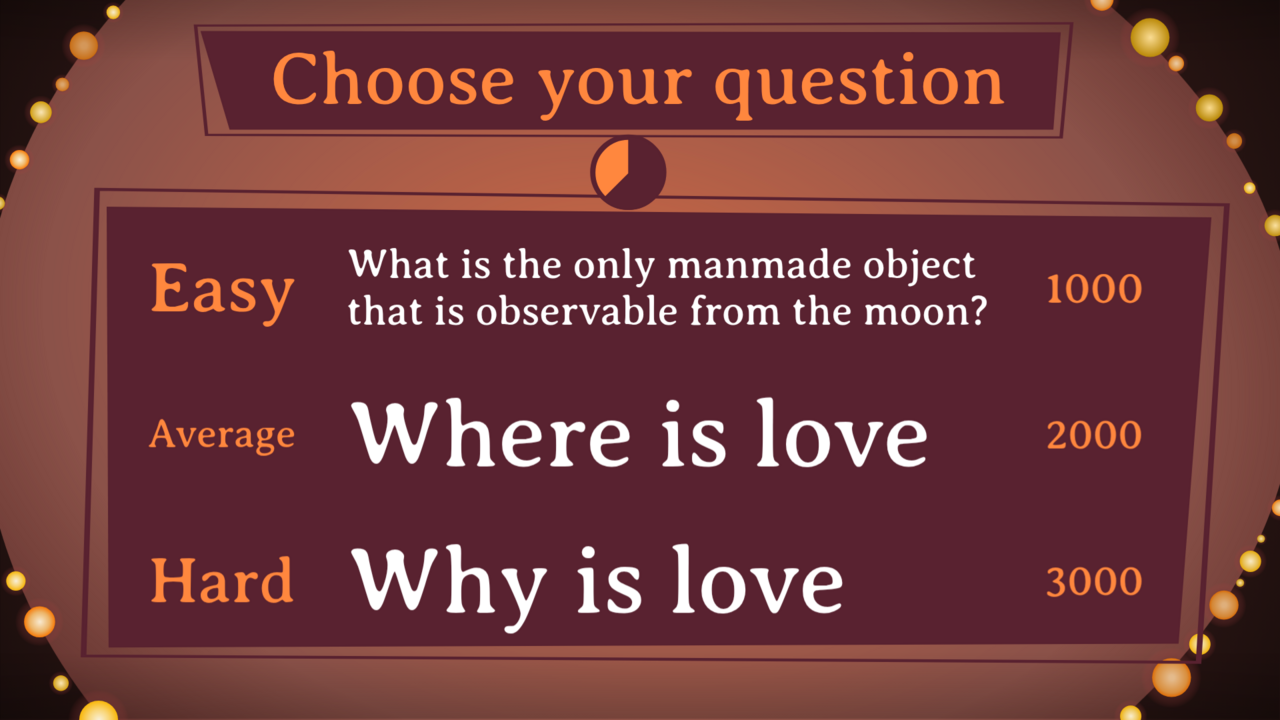
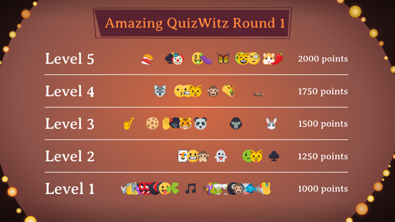
Frame 1 — the general frame
Two very different game moments on the same template: a question picker and a points ladder. It shows how much work that one frame does for you, and why its content area needs to be roomy and neutral.
Frame 2 — connect and waiting
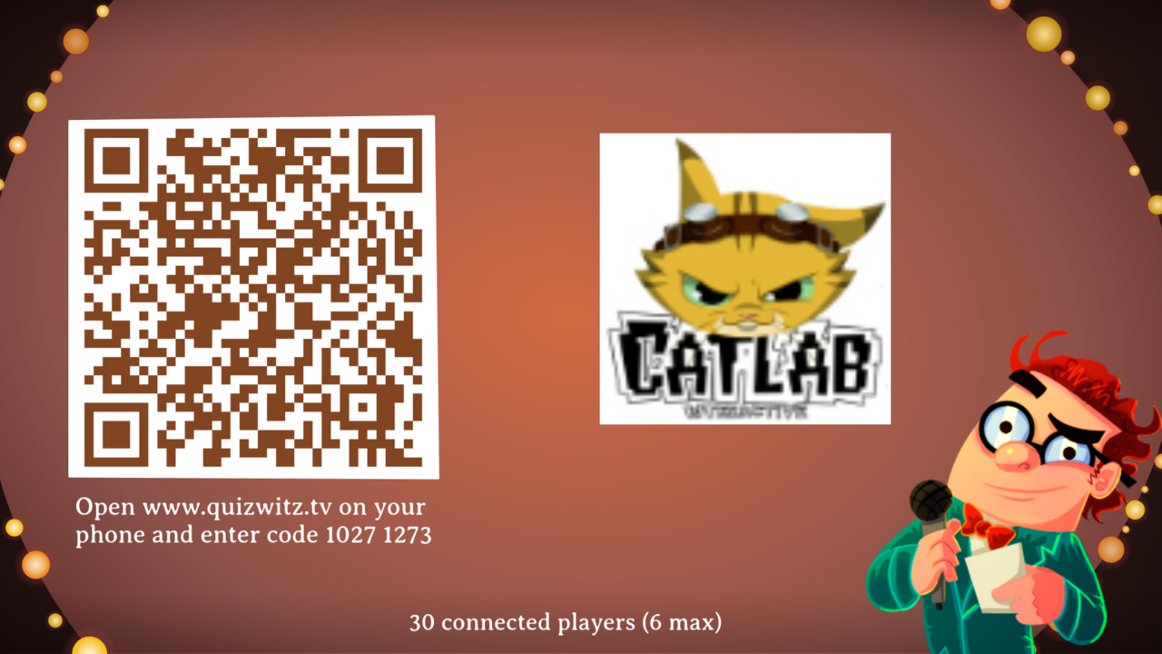
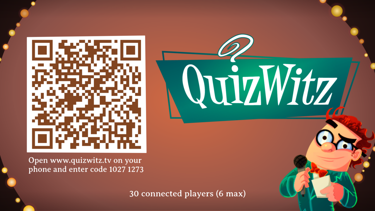
With a client logo beside the join code, and without one, where the theme's own artwork carries the screen:
The waiting screen that follows, on display while the quizmaster reads the question aloud:
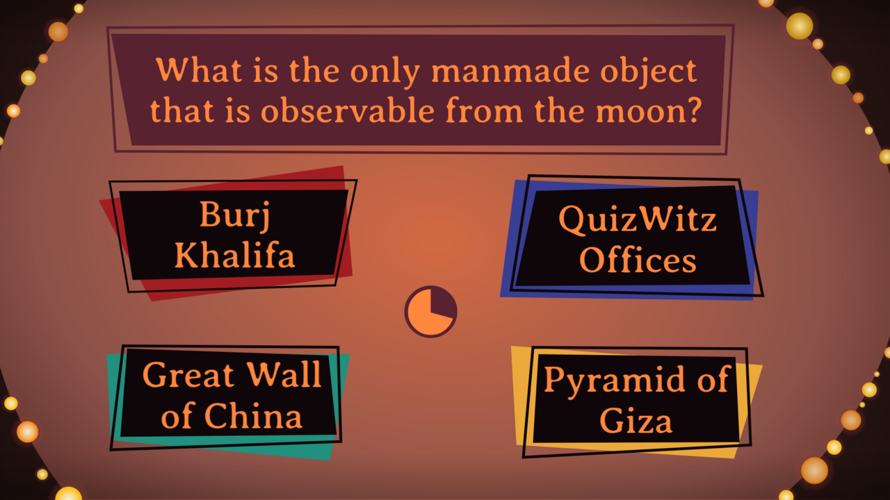
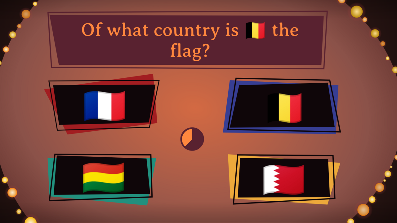
Frame 3 — the question screen
Four options, the question above, the timer in the middle. Note that an option can consist of nothing but an emoji.
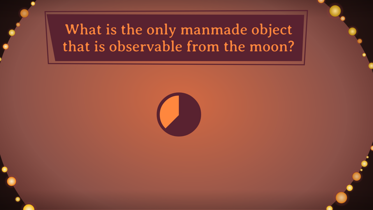
A question with no options — players type their answer on their phone. The screen is nearly empty and the timer becomes the main element:
The moment time runs out. The feedback balloon appears over the screen and the timer is empty:
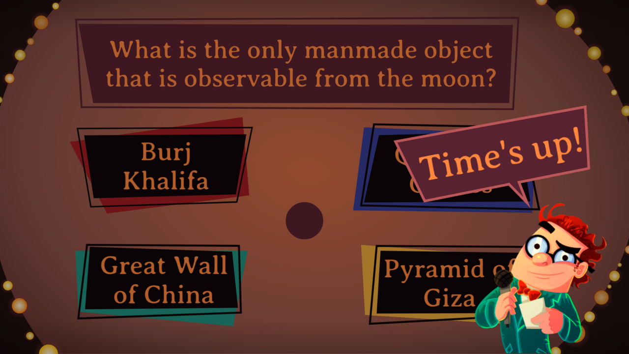
Frame 4 — media
The same parts, rearranged around a media area, with the options to the left and right:
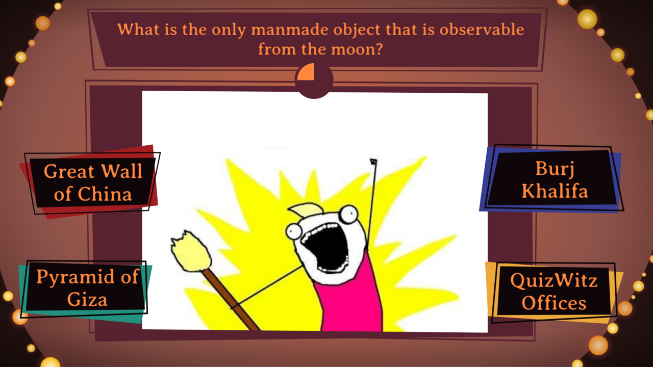
Media on its own, filling the screen:
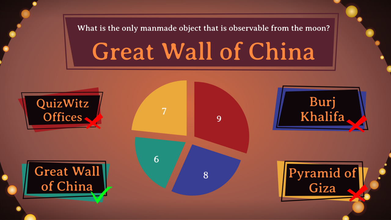
Frame 5 — the answer screen
This screen goes through three moments. First the spread, with nothing marked yet:
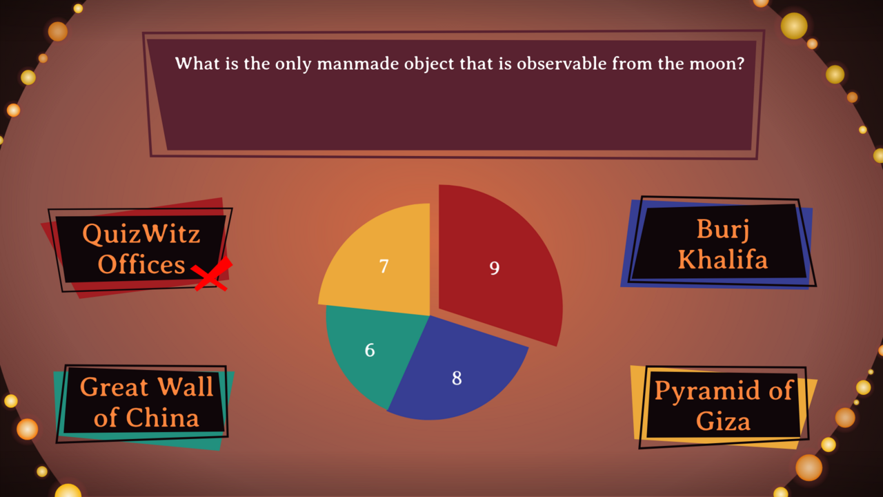
Then the correct option is ticked and the wrong ones crossed:
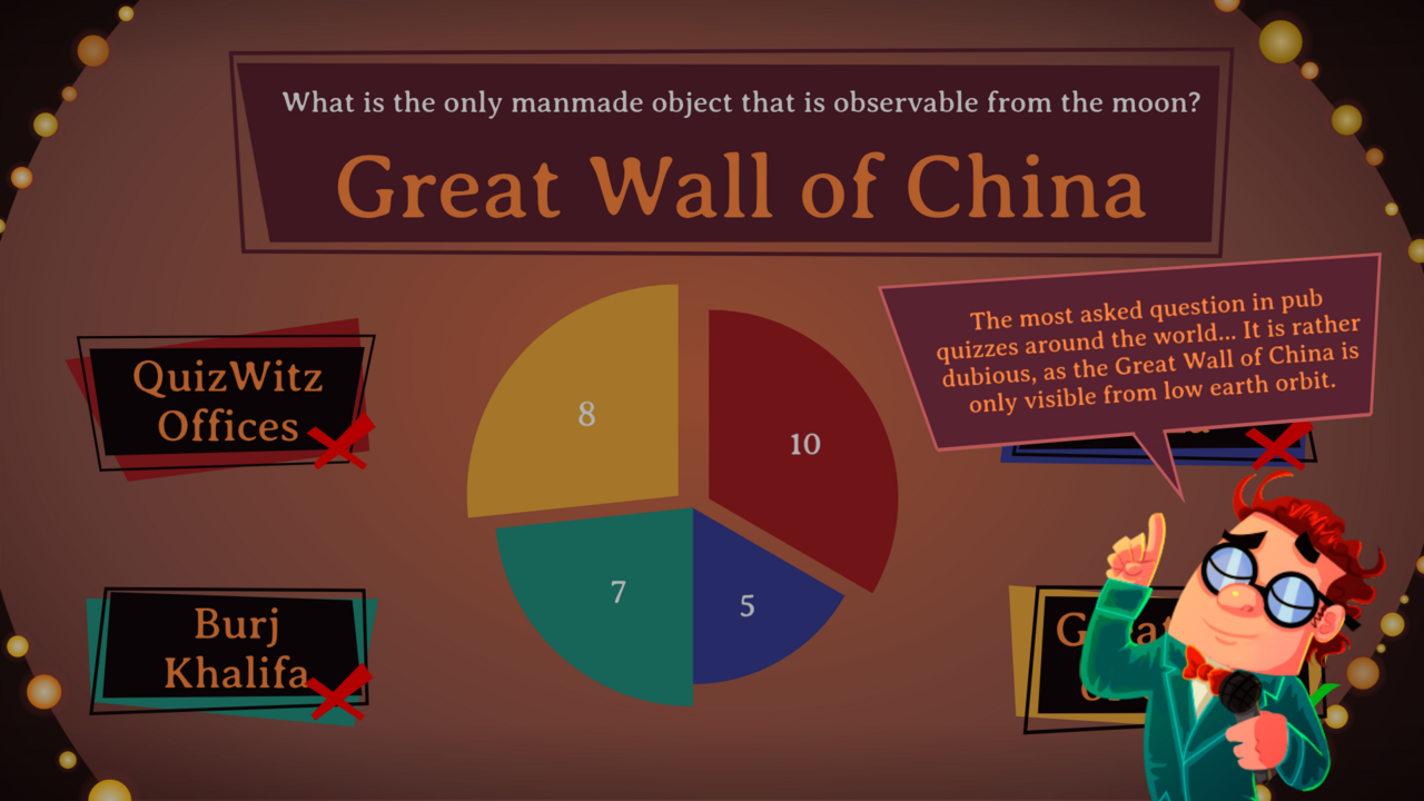
And if the question carries an explanation, a balloon drops over the artwork. Leave room for it — it lands on top of whatever you designed:
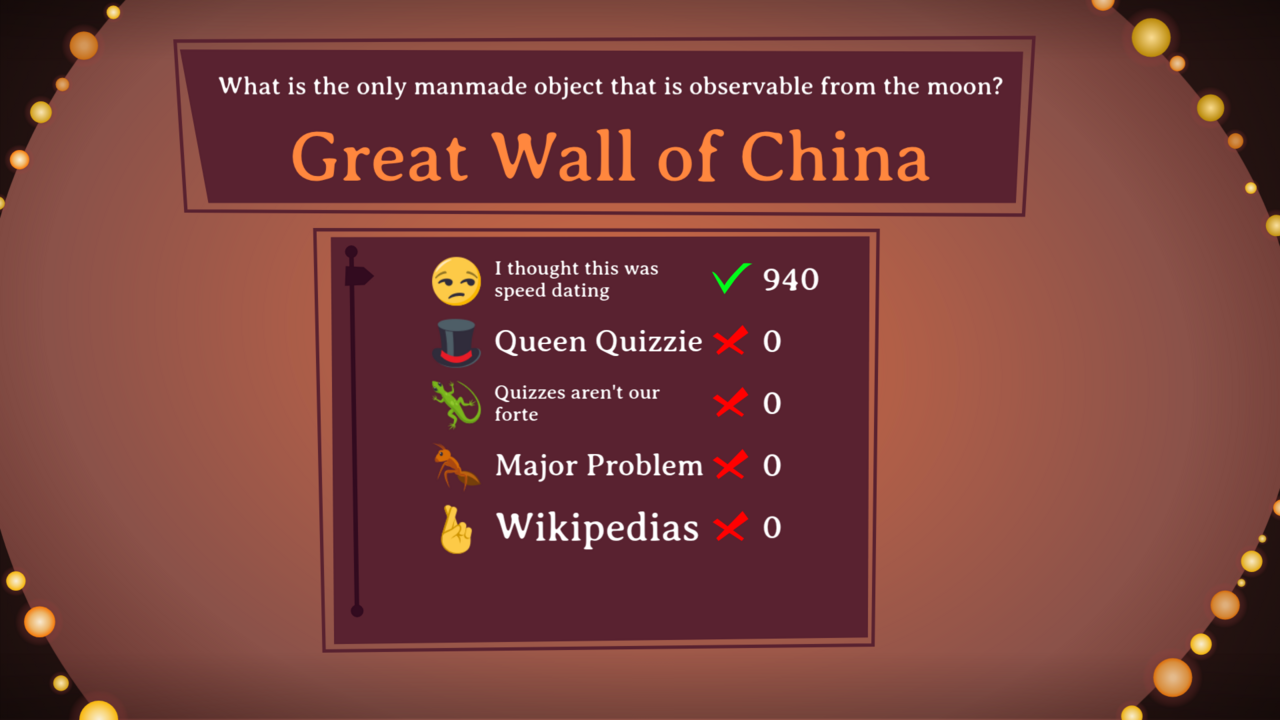
With a small group, the same moment is a score list rather than a chart:
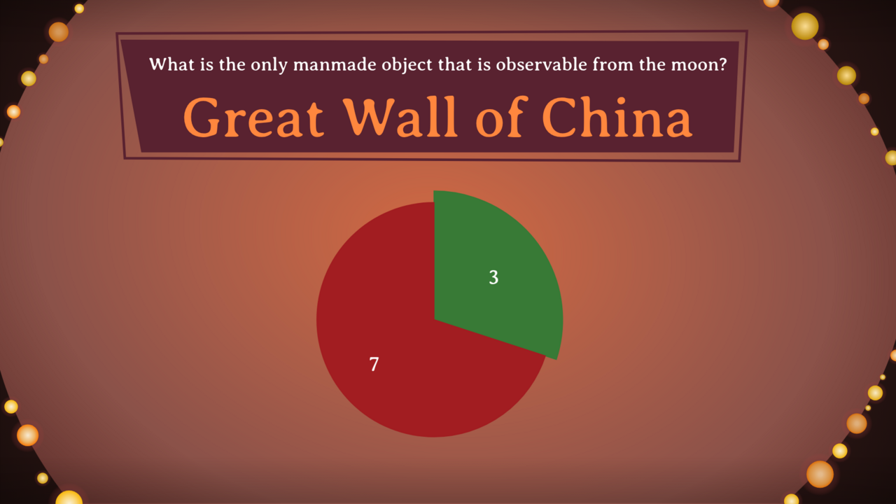
For an open question, the chart shows how many players got it right:
Frame 6 — standings and winner
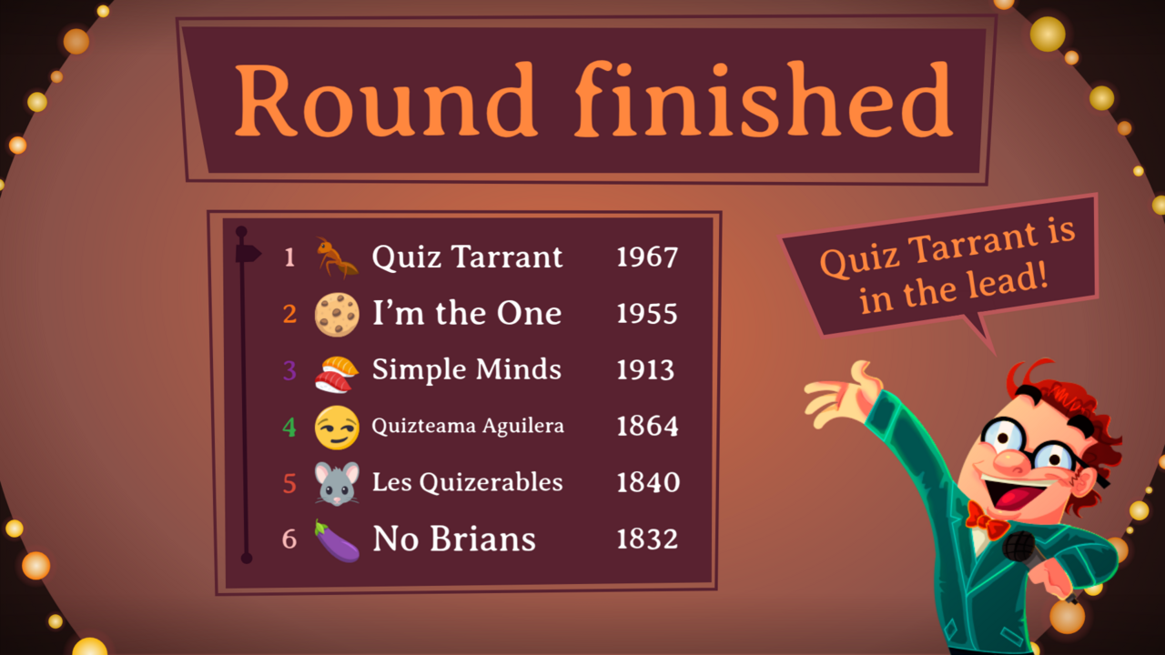
The standings after a round. The player row is the element that repeats: position, avatar, name, score.
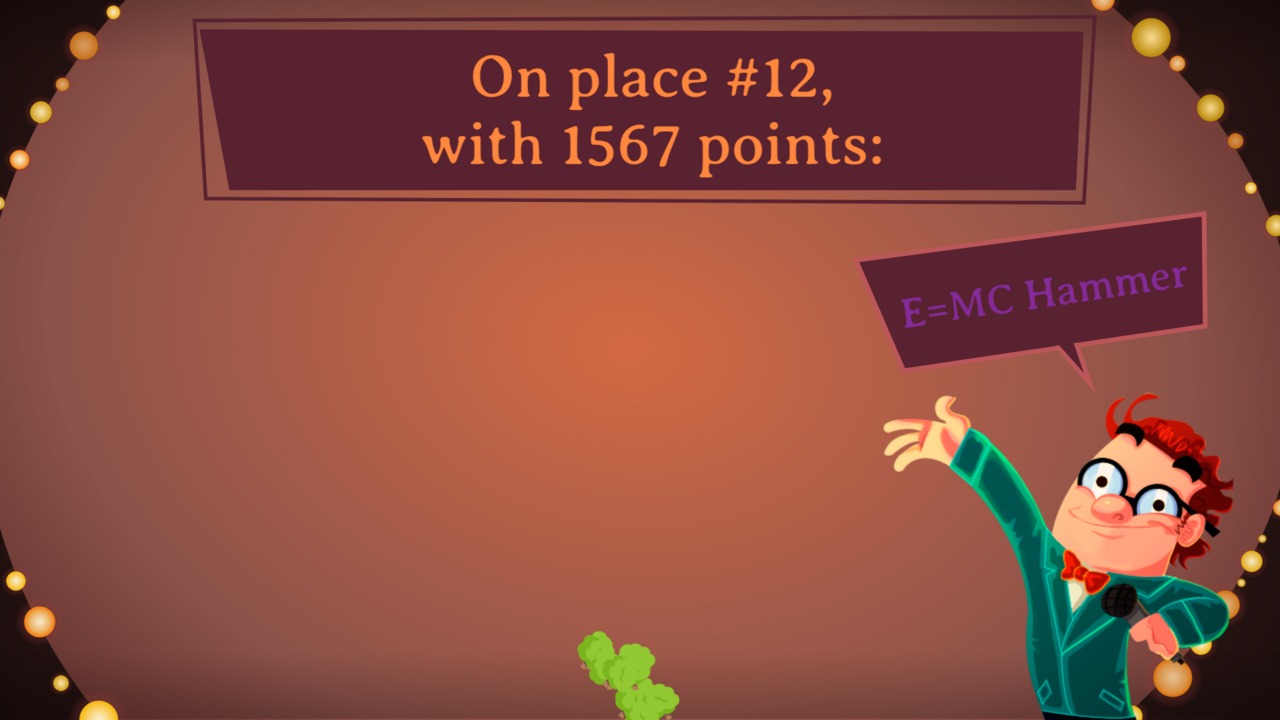
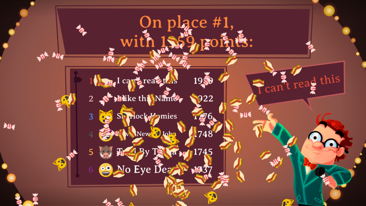
The final countdown names one player at a time, from last place to first — place, score and team name in the spotlight:
Frame 7 — the round intro
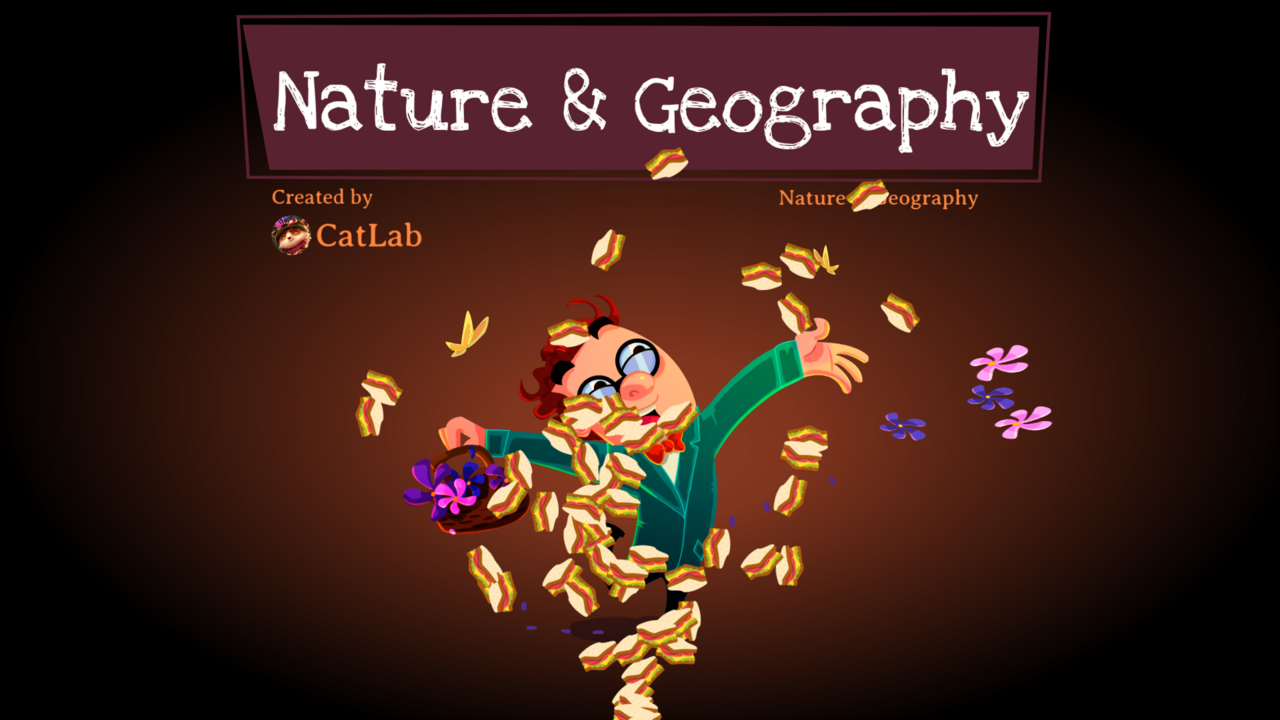
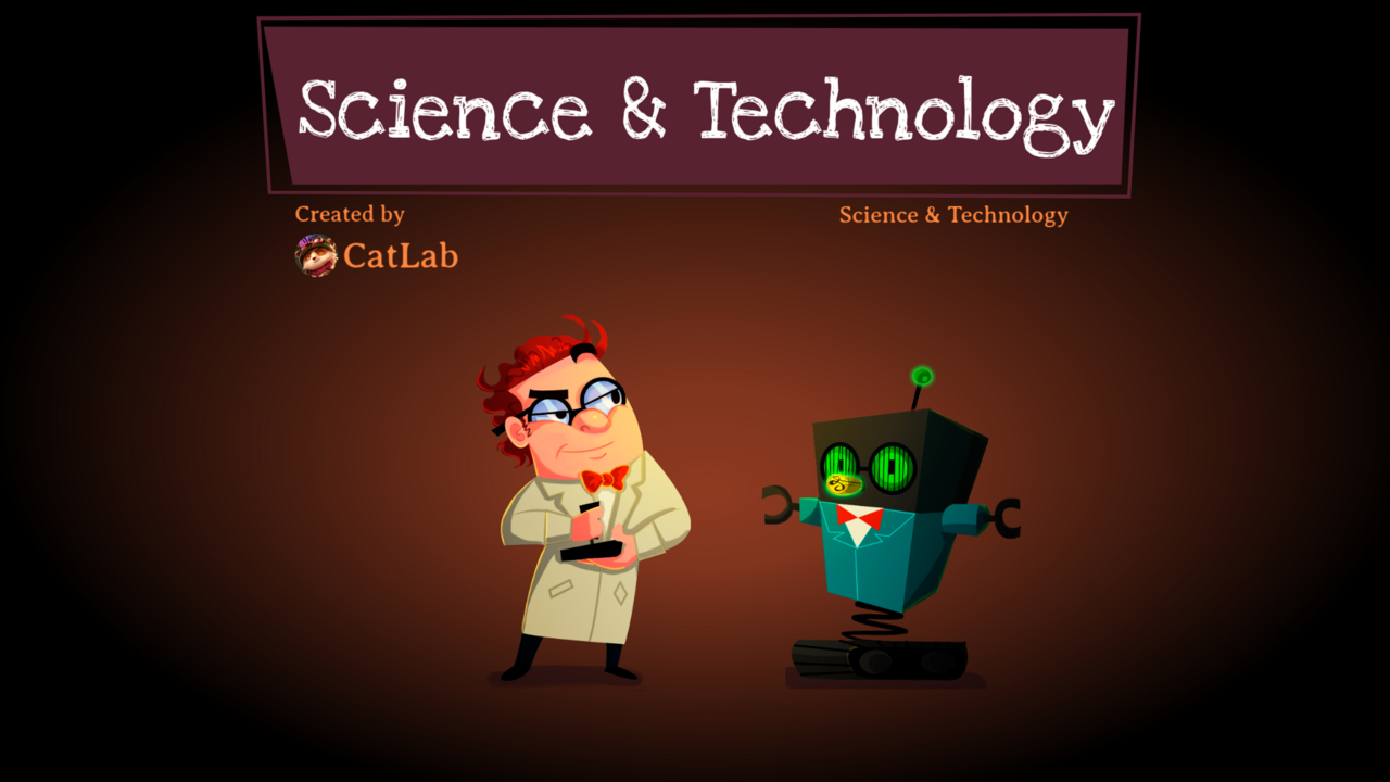
One design, optionally with a variant per category:
Design rules
None of these limit your visual design. They are about how the file is built.
Format
- 1920 × 1080 pixels, exactly. One frame per screen.
- Work in vector where you can. Where you use raster (photos, textures): at least 2× display size.
- The game runs at 24 frames per second. Relevant if you supply motion ideas.
- Keep a 5% margin at the edges free of essential information. Projectors crop.
Layer structure — the rule that matters most
Anything that can move, appear or change value sits on its own named layer. Nothing merged, nothing flattened.
In practice: the four answer options are four separate layers, not one. The timer is separate from the background. A button and its label are two elements. A player row is one group that can be duplicated.
What may be merged: purely decorative background artwork that works as a single still image.
This is the one rule that genuinely hurts when it is not followed — the artwork then has to be pulled apart or redrawn, which is exactly the cost this arrangement is meant to avoid.
Effects that do not survive
The engine draws on an HTML5 canvas. These have to be baked into the image or left out:
- Live blur, drop shadows and glow as filters → supply them as artwork
- Blend modes (multiply, screen, overlay) → resolve them to flat colour
- Layer effects and adjustment layers
- Gradients inside text, or text with a per-character outline
- Masks that change per frame
Gradients in shapes are fine. Transparency is fine. Shadows as fixed artwork are fine.
How text behaves
This is where designing for QuizWitz differs most from ordinary design work.
You do not set a font size. You draw a box.
All text is drawn live by a component that receives two things: a string, and the rectangle you drew. It then finds the largest font size at which that string, wrapped across lines, still fits inside the box. A long string shrinks to fit; a short one grows until the box is full.
Three rows, three identical boxes — and three completely different font sizes, purely because the text is shorter or longer. "Where is love" gets the full height; the question above it has to make do with two small lines. The labels on the left behave the same way.
What follows from that:
- The same question looks different in another game. A six-word question appears large and screen-filling; a thirty-five-word one appears small across five lines, in exactly the same box. Both have to look right.
- Design every text box twice. Fill it once with a very short sample and once with a very long one, and check that the composition holds in both. As a rule of thumb: an answer option runs from one to about eight words, a question from five to forty, a player name from two to twenty characters.
- Do not count on a fixed number of lines. A title that is "always on one line" does not exist here.
- Do not optically align text with anything else. Text that has to line up with a rule or a shape will drift as soon as it is shorter or longer. Use boxes that are roomy enough and an alignment (left, centred, right) instead of exact positions.
- The box is a maximum, not a promise. You design its proportions; the fill varies.
- Eleven languages. German compounds are long, and Hungarian is no kinder. A box that is tight in English drops to an unreadably small size in German.
- Emoji can appear inside text. Players pick one next to their team name, and a question or an option can contain one — sometimes an option is nothing but an emoji. They are drawn in colour and are taller than the letters around them.
What the build needs to know about each text box: where it is, how big it is, how it is aligned, which colour and which font. Not: at what point size.
Two things follow that you can use: a large box with short text becomes a strong typographic composition by itself, and a box you deliberately make narrow and tall forces text into a column. You can use the fitting as a design device — you just should not design against it.
The timer — required, and it is an animation
Every question screen has a timer. It is not optional; the room has to see how much time is left. Both question frames carry one.
The timer is not a counting number but an animation whose playhead the engine moves. You design a progression from "full" to "empty" — a bar draining, a ring closing, an hourglass, a shrinking line. The engine plays that animation at exactly the speed that makes the last frame coincide with the end of the question.
What follows:
- The question duration is not fixed. It is set per quiz — often twenty to thirty seconds, but it can be shorter or longer. Your animation is stretched or compressed to fit. Design a progression, not an animation of a set number of seconds.
- No numbers or per-second ticks. A timer counting "20, 19, 18…" stops being true as soon as the duration changes.
- The last seconds are the tensest moment of the game. It helps if the progression becomes clearer or more urgent towards the end.
- Legible from the back of the room, at a glance.
- Multiple timers are allowed. A bar at the top and a ring near the question are both driven, as long as each is named
timer.
Supply the timer as a series of keyframes or as a description of the progression — "the bar drains right to left and shifts from green to red" is enough.
Fonts
- Fonts must be embeddable. The
.ttfor.otffile is needed, plus a licence that allows embedding in an application. A font licensed only as a webfont, or only for print, cannot be used. Check this before designing with it; it is an expensive correction afterwards. - Fonts with unusually large ascenders or descenders can be compensated for, but flag it if you use one.
Colour as a list
The theme reads a colour list from a configuration file. Supply your palette as a named list, not only as colours in the artwork:
main colour, accent colour, background, default text colour, header text colour, question text colour, button text, the four answer colours (each with a background and a border colour), the colour for correct, the colour for wrong.
Gradients are allowed: give them as two hex values.
The QuizWitz logo
Custom designs include the QuizWitz logo. Reserve a place for it where it does not get in the way of the design.
What to hand over
Source file — Illustrator preferred
Adobe Illustrator (.ai) is preferred, and there is a concrete reason. The theme is built in Adobe Animate, which imports Illustrator files directly and converts your layers into Animate layers or separate symbols, keeping the layer names and leaving the vectors editable. That is exactly the step that saves the artwork from being rebuilt by hand.
Figma or Photoshop is possible, but know the cost: with Figma everything goes through SVG and PNG export, and that is precisely where the layer structure needed here is lost. If you do use Figma, supply each element separately as SVG, with filenames matching the layer names, so the structure can be rebuilt by hand. Photoshop imports into Animate with its layers intact, like Illustrator, but gives you raster instead of vector.
If you are faster in Figma, use it for the concept phase and deliver the final version in Illustrator.
File structure:
- One artboard per screen, each exactly 1920 × 1080, named after the frames above.
- Reusable parts (button, player row, answer option, timer) as symbols or components, not as loose copies.
- Layer names in English, without spaces:
question,option1tooption4,timer,feedback,header,background,playerScore. - Colours as named swatches and text as named styles, rather than set on each object individually.
Exports
- Each frame as a PNG, 1920 × 1080 — as a reference for how it should look.
- Each separate graphic element as a transparent PNG at 2×, in one folder, filename matching the layer name.
- Fonts as
.ttfor.otf, with proof of licence.
Half a page of notes
A short written note: what the idea is, how the options should appear, what moves and what stays still. Not a ten-page design rationale — whoever builds the theme needs to know what to build.
Motion ideas may be described or supplied as a rough animatic.
Appendix — symbol names
For completeness, and for anyone who wants to know exactly where their artwork ends up. You do not need to read this to do the work; the seven frames above are enough. Using these names as layer names saves a translation step.
| Frame | Symbol name | Required parts |
|---|---|---|
| 1. General frame | GeneralPurposeScreen, GeneralPurposeScreenWithHeader | header.text, content area |
| 2. Connect screen | PresentationConnectScreen | instructions.line1 to line5 |
| 2b. Waiting screen | PendingScreen | header.text |
| 3. Question screen | QuestionScreen | question.text, timer, feedback.text, option1 to option4, frame labels showOptions and showFeedback |
| 4. Question with media | QuestionScreenAttachment | as above, plus attachment.placeholder |
| 4b. Full-screen media | AttachmentScreen | placeholder |
| 5. Answer screen | AnswerPieScreen | option1 to option4, answer.text, feedback.text |
| 5b. Open question answer | AnswerScreen, AnswerOpenQuestionPieScreen | answer.text, feedback.text, players, piechart |
| 6. Standings | WinnerScreen + PlayerScore | header.text, players, feedback.text (playAgain.text optional) |
| 7. Round intro | RoundIntroTedMusic, RoundIntroTedSport, RoundIntroScienceAndTech, RoundIntroFloraAndFauna, RoundIntroTedCultHist | — |
| — | LoadingScreen | text, progress |
| — | Button, Checkbox, Slider, QuestionSelect, SymbolCorrect, SymbolWrong, SettingsScreenScrollarea, AlertScreen, ActivityScreen, MenuScreen, SettingsScreen, PackListItem | no artwork of their own needed — built from your frames and the general frame |
The round intro names contain "Ted" for historical reasons. That is a leftover from the original theme and does not mean a character has to appear in them.
Every element with .text after it is a fitted text box as described above: a rectangle the engine fills itself. The timer element is a movie clip with its own timeline; the engine reads its frame count and moves the playhead in proportion to elapsed time.
What the configuration file takes from your design
{
  "fonts":  { "default": "<body font>", "header": "<heading font>" },
  "colors": {
    "_accent_": "#…", "_main_": "#…", "_background_": "#…-#…",
    "default": "#…", "header": "#…", "question": "#…",
    "buttons": "#…", "dialog": "#…",
    "_optionColors_": [ { "background": "#…-#…", "border": "#…" } ]
  },
  "booleanResultColors": { "correct": "#…", "wrong": "#…" },
  "overlay": "light | dark"
}